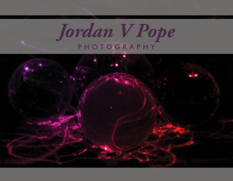
Going out into the workforce, One needs to have some way to be noticeable. Businesses do this by using Branding and Logos that people can recognize. As individuals, we can also employ this strategy. This Identity project is a process to design a effective, useful brand identity through the development of a personal logo.
In an effort to develop a strong design, I have searched through Pinterest as well as conducted a survey over Facebook. With Pinterest, I went through and pinned images of inspiring logo designs.
This is one of the pins that I thought was really good.

The design is the personal brand and identity of Jacek Jędraszczak. I cropped this image, but the full image, which includes all of his design process here: https://www.behance.net/gallery/Jacek-Jedraszczak-Personal-Identity/10126085
I chose this design and I really like it for the sleek minimal design that he put into, the geometric build to it, and the strong, vibrant use of color. Many of my other pins show similar things. I really like minimal geometric designs.
Here is a link to my Pinterest board for my pinned inspiration: https://www.pinterest.com/jordanpope779/indentity-inspiration/
The Facebook survey was quite simple. I posted to my friends to tell me what words came to mind when they thought of me. I received quite a bit of useful and insightful ideas, though nothing is really surprising. Some of the feedback I got was: Deep thinking, Talented artist, Quirky, Talented, Sincere, Playful, Smart, Kind, Introspective, Amazing, Loving, as well as other similar things. These things are not new ideas to me for many of them have been things that I have tried to cultivate, it is helpful to know that these are things that people see in me.
When designing my logo, it is important to design for those that I want to attract. I, in the end, want to be hired for my art in Illustration first and foremost, but in Graphic Design and Web Design efforts as well. In Illustration, the main target audience would be people that need fantasy and science fiction art.
Here is a rough timeline for the project:
September 21, (Mon) – Sketch 30+ logos
September 22, (Tues) – Get feedback – Refine and simplify, Choose best Designs
September 23, (Wed) – Choose colors, fonts, etc, Get feedback
September 24, (Thu) – Vectorize all three logos, Get feedback
September 25, (Fri) – Clean up and simplify vectors, Get feedback
September 26, (Sat) – Revise and refine, Get feedback, Finalize
September 29, (Tues) – Final Touches